2.4.5 The .GRAPH Statement
To download the examples for Module 2, click Module_2_Examples.zip
In this topic:
What You Will Learn
- How to use .GRAPH statements to automatically generate curves from arbitrary expressions.
Getting Started
Exercise #1: Run a Simulation With a .GRAPH Statement
- Open the schematic 2.6_SelfOscillatingConverter_POP_dot_graph.sxsch.
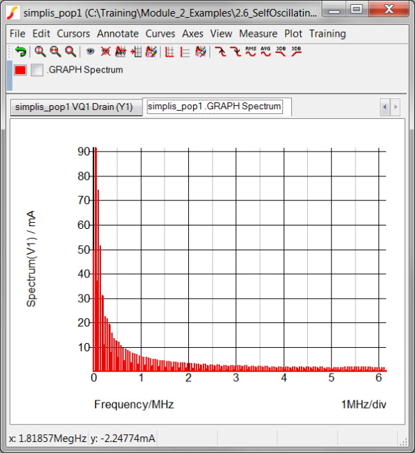
- Run the simulation. Result: The POP simulation executes and the frequency spectrum of the current in V1 is automatically plotted on the waveform viewer:
Discussion
In the previous topic, 2.4.4 Plotting Frequency Spectrums, you learned how to generate frequency spectrum plots using the Spectrum function. In this topic you will automatically plot the Spectrum function using the .GRAPH statement.
The .GRAPH statement is the underlying method SIMetrix/SIMPLIS uses to automatically generate curves after a simulation completes. A fixed schematic probe is nothing more than a symbol which composes an appropriate .GRAPH statement for plotting after the simulation completes. Because the .GRAPH statement is well documented and you have a way to add content to the netlist with the command (F11) window, you can easily generate your own custom probes using the .GRAPH statement.
In the example from the Getting Started section, a Spectrum function is used in conjunction with a .GRAPH statement to generate the frequency spectrum plot. The .GRAPH statement is stored in the F11 window of the schematic. To view the .GRAPH statement,
- Press F11 to open the command (F11) window.
- Scroll down until you come to the lines shown in the box below. The three lines
after the comment line generate the spectrum
graph:
*** graphs a frequency spectrum using the Spectrum function
.GRAPH "Spectrum( :V1#P , 4096 )"
+ axisType="auto" persistence=1 graphName="spectrum" curveLabel=".GRAPH Spectrum"
+ analysis="pop" xLog="auto" yLog="lin"  nowarn=true xLabel="Frequency" yLabel="Spectrum(V1)" xUnit="Hz" yUnit="A"
.GRAPH "Spectrum( :V1#P , 4096 )"
The expression must be enclosed in double quotes. Notice this expression is exactly the same expression you used in the previous 2.4.4 Plotting Frequency Spectrums topic. Spaces have been added for readability. All whitespace is removed when evaluating expressions.
+ axisType="auto" persistence=1 graphName="spectrum" curveLabel=".GRAPH Spectrum"
+ analysis="pop" xLog="auto" yLog="lin" nowarn=true xLabel="Frequency" yLabel="Spectrum(V1)" xUnit="Hz" yUnit="A"
This line sets up the axis labels and units, as well as the scaling for the axes. The analysis option is particularly important. Because the analysis option is set to pop, the curve is only generated for POP analyses.
A few rules will be helpful when composing .GRAPH statements:
- No options are sensitive to capitalization. The program will interpret .graph the same as .GRAPH.
- Expressions must be enclosed in double quotes.
- Any option value on the right hand side of the equals sign must be enclosed in double quotes if that option value contains spaces. The curveLabel above is a good example.
- The order of options doesn't matter.
- The expression must appear after the .GRAPH, and before any options.
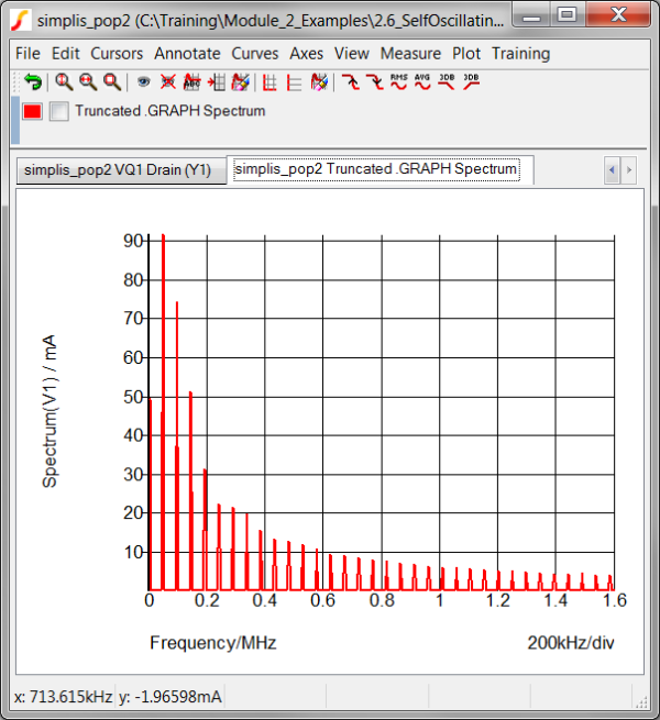
The spectrum plotted in the Getting Started section contains more frequencies than you might want. The next exercise truncates the plot with the built-in Truncate function.
Exercise #2: Limiting the Frequency Range with the Truncate Function
"Truncate( Mag( Spectrum( :V1#P , 2^12 ) ) , 0 , 1.6Meg )"
This expression has three nested functions. The functions are evaluated in order from the inner-most to the outer-most. In this example, the three functions evaluated are:
- Spectrum( :V1#P , 2^12 )
- Mag( Spectrum( :V1#P , 2^12 ) )
- Truncate( Mag( Spectrum( :V1#P , 2^12 ) ) , 0 , 1.6Meg )
You have to insert the Mag() function because the Spectrum function returns the complex data from the FFT, and the Truncate function is expecting a real argument. The Mag() function takes the magnitude of the complex argument, returning a real vector. You then pass this result onto the Truncate function to chop off the higher frequencies plot the result.
The example schematic already has the .GRAPH statement for this exercise stored in the F11 window of the schematic. All you need to do is comment out the default .GRAPH statement, and un-comment the new .GRAPH statement. To produce the spectrum curve over a more limited frequency span,
- Press F11 to open the command (F11) window.
- Scroll down to the first un-commented .GRAPH line. You are looking for the lines:
.GRAPH "Spectrum( :V1#P , 4096 )"
+ axisType="auto" persistence=1 graphName="spectrum" curveLabel=".GRAPH Spectrum"
+ analysis="pop" xLog="auto" yLog="lin"  nowarn=true xLabel="Frequency" yLabel="Spectrum(V1)" xUnit="Hz" yUnit="A"
- Type an asterisk before each of the .GRAPH and two options lines which start with a + character.
- Scroll down to the next block of text which defines the truncated frequency
spectrum.
*** graphs a truncated frequency spectrum using the Spectrum function
*** Exercise #1: comment out the above .GRAPH lines and options, uncomment the next three lines
*.GRAPH "Truncate( Mag( Spectrum( :V1#P , 2^12 ) ) , 0 , 1.6Meg )"
*+ axisType="auto" persistence=1 graphName="spectrum" curveLabel="Truncated .GRAPH Spectrum"
*+ analysis="pop" xLog="auto" yLog="lin" nowarn=true xLabel="Frequency" yLabel="Spectrum(V1)" xUnit="Hz" yUnit="A"
- Delete the leading asterisks from the .GRAPH and two options lines. The new text
should be exactly:
*** graphs a truncated frequency spectrum using the Spectrum function
*** Exercise #1: comment out the above .GRAPH lines and options, uncomment the next three lines
.GRAPH "Truncate( Mag( Spectrum( :V1#P , 2^12 ) ) , 0 , 1.6Meg )"
+ axisType="auto" persistence=1 graphName="spectrum" curveLabel="Truncated .GRAPH Spectrum"
+ analysis="pop" xLog="auto" yLog="lin"
	 nowarn=true xLabel="Frequency" yLabel="Spectrum(V1)"
	 xUnit="Hz" yUnit="A"
- Close the waveform viewer and run the simulation. Result: The new spectrum plot is generated over the frequency range of zero to 1.6Meg Hz.
Exercise #3: Adding a Second Curve to the same Graph
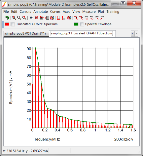
In this short example you will add another curve to the Spectrum graph. The new curve will plot the maximum values of the Spectrum, that is, a spectral envelope.
"Maxima( Truncate( Mag( Spectrum( :V1#P , 2^12 ) ) , 40k , 1.6Meg ) )"
Note that compared to exercise #1, you have only added the Maxima function around the original Spectrum function. You also have changed the minimum frequency range on the Truncate function to eliminate the DC value, which is not of interest here. As with exercise #1, the .GRAPH statement and the associated options are already located in the F11 window. To add the spectral envelope,
- Press F11 to open the command (F11) window.
- Scroll down to the last block of text. The text should be as follows:
*** this .GRAPH statement adds a curve at the maxima of the spectrum
*** Exercise #2: Uncomment the next three lines
*.GRAPH "Maxima( Truncate( Mag( Spectrum( :V1#P , 2^12 ) ) , 40k , 1.6Meg ) )"
*+ axisType="auto" persistence=1 graphName="spectrum" curveLabel="Spectral Envelope"
*+ analysis="pop" xLog="auto" yLog="lin" nowarn=true xLabel="Frequency" yLabel="Spectrum(V1)"
	 xUnit="Hz" yUnit="A"
- Delete the leading asterisks from the .GRAPH and two options lines. The new text
should be exactly:
*** this .GRAPH statement adds a curve at the maxima of the spectrum
*** Exercise #2: Uncomment the next three lines
.GRAPH "Maxima( Truncate( Mag( Spectrum( :V1#P , 2^12 ) ) , 40k , 1.6Meg ) )"
+ axisType="auto" persistence=1 graphName="spectrum" curveLabel="Spectral Envelope"
+ analysis="pop" xLog="auto" yLog="lin" nowarn=true xLabel="Frequency" yLabel="Spectrum(V1)"
	 xUnit="Hz" yUnit="A"
CAUTION:You must comment out each line or syntax errors will halt the simulation. - Close the waveform viewer and run the simulation. Result: The Spectral Envelope curve is added to the Truncated .GRAPH Spectrum plot.
Exercise #4: What Can Go Wrong?
*** this .PRINT statement brings individual vectors out to the data group. .PRINT I(V1)
In this exercise you will comment out the .PRINT statement and change the Save options to output only voltages. The vector which you are probing is a current, and will no longer be output to the data group. This will prevent the plotting of the curves which are functions of the input current V1#P. As you will see, the .GRAPH statement will fail and no spectrum plots will be generated.
- Close the waveform viewer window.
- On the schematic window, press F11 to open the command (F11) window.
- Type an asterisk before the .PRINT statement. The F11 window content should look
like:
*** this .PRINT statement brings individual vectors out to the data group.
*.PRINT I(V1)
- From the schematic menu, select Choose Analysis... menu option. The keyboard shortcut
F8 will execute this menu item. Result: The Choose Analysis dialog opens to the POP tab:
- Select the Voltages Only radio button as shown below:
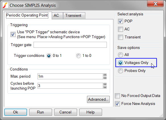
- Click Run. Result: The Spectrum plot is not generated because the current vector V1#P is not output to the data group.
Conclusions and Key Points to Remember
- The .GRAPH statement allows you to automatically plot any combination of vectors as an expression after the simulation completes.
- There are several very powerful Built-in functions which can be combined in the expression to be plotted.
- You have total control over the axis names, curve label, etc. when using the .graph control.
- It is best to ensure the desired vectors to be graphed are output to the data group by using the .PRINT statement.
- The .GRAPH describes all .GRAPH options.